Saturday, 12 April 2014

Evaluation


Question 1:
Embedded below is the answer to question 1 of the evaluation, answered by Myself using Dipity.


Little Mix conventions on Dipity.

Overall we did conform to many conventions within our music video such what is conventionally seen as girly and the types of clothes that they have worn. However he have tried to subvert some typical conventions such as the girls not wanting their love interest in the end and therefore rejecting the idea that only by having male the girls will be happy.


Question 2:
Embedded below is the answer to question 2, answered by Kala Hill using Prezi.


Question 3:
Embedded below is the answer to question 3, answered by Georgia Pearce using Prezi.


Question 4:
Embedded below is the answer to question 4, answered by Kala Hill.

Friday, 11 April 2014

Our music video

Embedded below is our finished music video. Once we had finish all editing using final cut pro , this was them exported and placed on Youtube. 


Thursday, 10 April 2014

Design Process

First of all Kala created our basic Digipak and Magazine advert, these were drafts that went by the sketches by looking at the completed digital format of these we realized that they needed to be altered to become more professional.

Before going ahead and creating our final magazine advert and digipak we went  through a design process. I firstly looked at Little mix's previous albums and adverts to see the types of colour's and fonts they tended to use. From this research we will then decide on what we will use to create our own.


Above you can see that I experimented with many different fonts which I believed followed Little mix's typical typology. We decided on using the fifth text down as we believe that it portrays Little Mix's girly side and highlights that this is a female dominated band. We wanted to keep true to their style and origins.


Above we decided on the image we would like to use of our magazine advert , I then went on to experiment with edit this image multiple times on Photoshop. I experimented with different colours and layouts , we decided as a group the use of the gradient would be more beneficial and professional. The last image embedded on here if the one we have chosen to use for our final Advert. This final magazine advert was created by myself and Kala.

Final music video, digipak and magazine advert for digipak upload


Final music video:

Directed by Faye Curry, produced by Kala Hill and edited by Georgia Pearce.


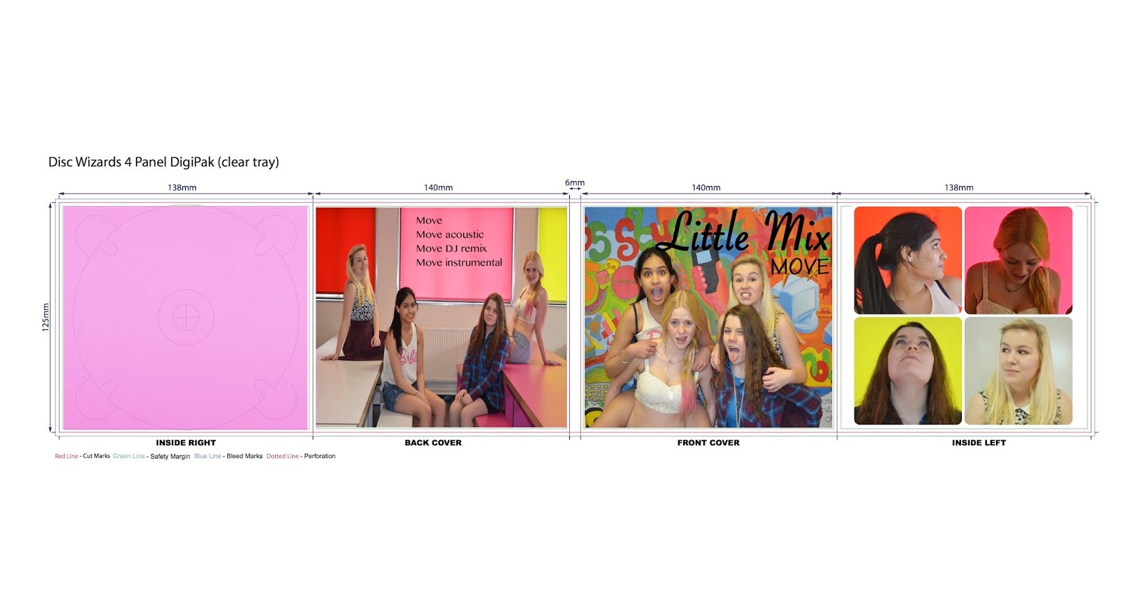
Kala and Georgia created the Final digipak for our album, embedded below is an image of the digipak.  They used research of other pop artists digipak's that Kala  had gathered to help create our own for Little mix. They used the typical conventions such as The artist name, The album title, The song list, Pictures of the artist and bright colours. The bright colours and fun pictures represent the typical conventions you would expect to see from Little Mix. The font that we chose to use for the Artist name is quiet a girly, this connotes that it is a girl band, the name is also large this shows the importance of them. For the name of the album they used a basic font and it is rather small and placed under the artist name, this is because it is not as important, however it is still one the front page as it is important for the customer to know the name of the album. For the song list they decided to use a standard font this was because the font would be rather small and it needed to be legible.


Then Kala and I went on to create a Magazine advert for advertising our digipak, to create this , again we had to research into existing magazine adverts for pop artists promoting their digipaks. The main point to this advert is to promote the release of our digipak, So we used a recognisable image from the digipak and a small image in the corner of the front cover of our digipak. The reasoning behind choosing a group  image as the main one for this advert is because it was the brightest and would therefore make the advert stand out the most. For the typography we used a balck girly font on a pink gradient this made the writing stand out, we ensured that we included all the main aspects such as the artist name, The single name and The release detail this is all the information that a consumer would need to know to purchase the single.


Sketches of magazine advert and digipak design

Embedded below is the sketch design of the magazine advert, created by Kala Hill:
When we looked at the sketch compared to our research, we then concluded that we needed a less separated image like the one below and use a group photo, as this we felt would represent the artist a lot more, and convey them more as a unit. We also felt that we needed more girly colours rather than blue and black, as it didn't adhere correctly to the original pop girl band conventions we have previously studied. Also, we discovered that in order to make it more professional, we needed details of download/purchase dates and companies, such as iTunes.


When we looked at the sketch compared to our research, we concluded that we needed something in the disk panel to represent the artist a lot more, and convey them more as a unit, which resulted in us choosing the signatures in the final design. Also, we discovered that in order to make it more professional, we needed details of track numbers, a barcode and companies, such as the record label Little Mix are signed to, being Syco Music and Sony Music.


Comparison of digipak promotional adverts

My team member Kala hill created all the research and creation of the digipak detailed below:

I have looked at some magazine adverts of pop artists promoting their albums and digipak's to help inspire me to create our own one for our music video.

First of all i looked at Rihanna's magazine advert for her new album.
 On this magazine advert, we are presented with;
The Artists name
The album name
Pictures of the artist
A picture of the album
Particular songs found on album
A different but similar picture to the digipak image
Bright bold colours
Typical aspects that represent that artist
The date of release 

I then looked at Katy Perry's magazine advert for her new album.
On this magazine advert, we are presented with;
The artist name 
The album name
Pictures of the artist
A picture of the album
Particular songs found on album
A different but similar picture to the digipak image
Aspects that we expect to see of this artist
Bright vibrant colours
The release date

From these two digipak adverts I can clearly see what the main aspects of a pop music digipak would be, this is going to help me create the perfect advert for our digipak by including these common aspects.

Analysis of Digipak's

Team member Kala Hill conducted research into digipaks , this is embedded below:

We each individualy analyses various digipak cover to help us start our progress to me creating our digipak.

Me and Georgia looked at Rihanna's "LOUD" digipak cover and analysed the aspects used though out it.
The typical conventions of album digipaks are to have an image of the artist, another convention would be to have the name of the artist and the album presented on the front, For example Rihanna's LOUD digipak has a close up of her face pulling a seductive facial expression, on the front panel with her name and the album name written at the top and bottom of the image. Another prominent convention is that the artists are displayed on the inside and outside, forming a 6 panel digipak in this case, you can create 4 panel digipaks as well. This digipak includes pockets for the CD's and a booklet which include lyrics from tracks on the album.
  The images of Rihanna in her digipak are very sexualised, this is appropriate for her album as it represents her genre of music. The provocative nature is also what will attract her target audience of teenage boys and girls. The photographs used are also clearly edited using photoshop, things such as her skin being perfectly airbrushed and flawless, this is a typical convention for pop music artists as they need to achieve the "perfect" appearance. The colours have also been edited, the red is very bright and vibrant, this colour also insinuates passion, lust and a sexual atmosphere and this colour is a star motif of this artist.
  The typography on her album was carefully chosen the title of the album in capital letters which connotes with the name of the album being LOUD, the artist name is also in capital letter to emphasis the importance of her name, however the font is quiet delicate which prevents the text distracting the consumer from the imagery.

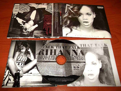
Faye researched into another Rihanna digipak called "Talk that talk" this enables me to compare the two different digipak's from the same pop artist and pick out the most common conventional aspects of a successful digipak cover.


Initially the first typical conventions on this digipak was the use of pictures of Rihanna. It is a typical 6 panel digipak, which had a variety of imagery of the artist Rihanna, secondly having the title of the album placed on the front is a very typical convention of a pop music digipak, along with including; the track list, production company and barcode.
  The imagery on this digipak is a very dominant aspect. These images have captured Rihanna's star motifs, she is typically seen in a provocative and sexual nature. This is apparent in these images as she is showing quiet a lot of skin and is sitting in a sexual manor e.g with her legs open. In addition to the sexuality of the images, having her mouth open in one of the images may be a reference to the title of the album "Talk that talk"
  A lot of the editing has been shown through the images. All of these have a black and white filter, and certain aspects of Rihanna has been brightened e.g her leg this draws the audiences attention to these area and appeals to the male gaze.

Behind the scenes video

When we created our music video , the green screen was an important part in this production , therefore we created this video embedded below to show the set up of this. We felt this would be a nice insight into how we created certain effects in our music video and how we prepared for this.


Location and costume images


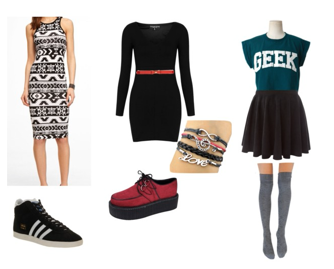
Created on polyvore , below we have created the costumes our actors will be wearing for our music video. All the outfits have been created in the style of the character they will be playing. These outfits have been created on polyvore. I created the costumes for Jade and Jesy while Georgia Pearce created the costumes for Perrie and Leigh-ann.


Jade Thirlwall 
Through prior research we are aware of Jade's certain style and clothing choices. She wears a lot of dresses and has a very cute style. We incorporated this through having her wear two dresses and then wearing a skirt. To keep to her style motif we included a lot of accessories and colours whenever we can. The outfit on the far left will be worn at the party , the one in the middle will be used during the individual green screen and lastly the one on the right will be worn during the bedroom.


Jesy Nelson 


Our costume choices for jesy is very dark and includes a lot of red and tartan. This is very typical of jesy as shown in a previous post, she also tends to be more covered up compared to the other members of little mix. Due to this we had her wear quite a lot of trousers and big shirts. The one the left will be worn at the party , the one in the middle will be worn on the individual green screen then finally the one of the right will be worn in the bedroom scene.


 Below are the two costumes that Georgia created: 

Embedded below are the Polyvore collages of final costume ideas for our music video, each collage representing each member. Faye created Jade and Jesy's collages and I created Perrie and Leigh-Anne's collages.

Perrie Edwards:

Perrie Video Shoot Costumes

For Perrie, we aimed for pastel colours and prints such as floral and spotty, to reflect her girly persona and closely adhere to the common outfits Perrie would normally wear. She wears a lot of floral print and so we aim to have her in florals. For the bedroom scene, Perrie will wear a light green/blue skater skirt and a black crop top. In the party scene, she will wear a collared playsuit and black and blue converse, and in the green screen scene she will wear pink jeans with a floral top and converse.


Leigh-Anne Pinnock:

Leigh - Anne Video Shoot Costumes
Leigh-Anne normally wears a lot of aztec print and bright colours, and so we want the actress who portrays Leigh-Anne to be as close to the style of Leigh-Anne as possible. For the bedroom scene we went for a pale blue top with short black shorts, a casual outfit for her, and for the party scene and green screen scenes we will have her in aztec print tops and dresses and converse of bright colours.


Then embedded below , I created a slideshow on Animoto which includes all our location image and the costumes for the group scene and the digipak photos.


Little Mix location and Costume images

Monday, 17 March 2014

Health and safety risk assessment

Risk assessment


Before filming we have to establish an dangers that we may encounter while filming and make sure we have quick affective solutions to deal with an problems which may a rise. I personally went on the fill out our risk assessment grid which is pasted below.


HAZARD
RISK
WHO IS AT RISK
CONTROL MEASURES
COMMENTS
/ACTIONS
RISK RATING
1 HIGH
2 MEDIUM
3 LOW
TICK IF ALL IN PLACE
Lights
Very bright
Get very hot
Wires
Actors
·       Try not to look at the lights to avoid any damage to the eyes
·       Take breaks and drink water due to heat
·       Be carful where you are walking


3


ü   
Green screen
May trip on the fabric
Actors
·    Move carefully when using the green screen to avoid tripping on the fabric


3


ü   
Asthma
Group member having asthma
Actor
·    Make sure they carry their inhaler with them at all times during filming.


2


ü   

Thursday, 13 March 2014

Filming schedule

Filming Schedule

Below I created a film schedule , it entails what shots we are going to film , where we are going to film, what characters will be required, how long it will take to film and what props will be needed. This is key resource to use throughout filming as it will help us organise our time more efficiently and  make sure we film every shot needed.


Shot Number
Description
Characters/Actors
Location
Time to film
Props and Kit
1, 2, 3, 4, 11, 14, 18, 22, 24, 28, 30, 32, 37, 41, 46, 49, 51, 59, 67, 76, 77, 78, 79, 83, 85, 88, 90, 91, 93, 94


Individual green screens
Kala/Leigh-anne
Georgia/ Perrie
Chloe/ Jesy
Ishpreet/ jade
School location – Oracy
1 hr
Camera
Tripod
Green screen
Lights
8, 10,12, 15, 19, 20, 25, 26, 27, 31, 33, 35


Bedroom scene
Kala/Leigh-anne
Georgia/ Perrie
Chloe/ Jesy
Ishpreet/ jade
House scene- Bedroom

1 ½ hrs
Camera
Tripod
6, 9, 13, 16, 21, 23, 29, 31, 34, 45, 47, 52, 55, 57, 60, 65, 75, 80, 82, 86, 89, 92, 96


Group room
Kala/Leigh-anne
Georgia/ Perrie
Chloe/ Jesy
Ishpreet/ Jade
School location – Oracy
1 hr
Camera
Tripod
Lights
7, 36, 38, 39, 40, 42, 43, 44, 48, 50, 53, 54, 56, 58, 66, 68, 69, 70, 71, 72, 73, 74, 81, 84, 87, 95


Party scene
Kala/Leigh-anne
Georgia/ Perrie
Chloe/ Jesy
Ishpreet/ Jade

10 extras
House scene- Living room
1 hr
Camera
Tripod