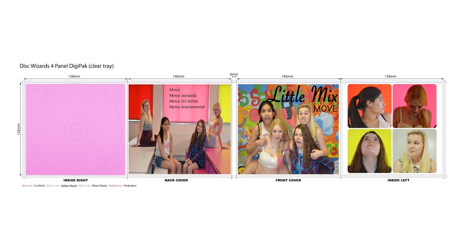
First of all Kala created our basic Digipak and Magazine advert, these were drafts that went by the sketches by looking at the completed digital format of these we realized that they needed to be altered to become more professional.

Before going ahead and creating our final magazine advert and digipak we went through a design process. I firstly looked at Little mix's previous albums and adverts to see the types of colour's and fonts they tended to use. From this research we will then decide on what we will use to create our own.

Above you can see that I experimented with many different fonts which I believed followed Little mix's typical typology. We decided on using the fifth text down as we believe that it portrays Little Mix's girly side and highlights that this is a female dominated band. We wanted to keep true to their style and origins.


No comments:
Post a Comment